By: Brad Lathrop
Did you know Power BI has artificial intelligence capabilities built right into the platform?
Users can create and include AI visualizations in Power BI Desktop reports, which can then be published to the Power BI service for sharing.
If you are unaware of Power BI’s AI capabilities and want a quick and simple overview, you’ve come to the right place! In this one, I’ll explain three visualizations that comprise Power BI artificial intelligence:
- Q&A visualization
- Key influencers visualization
- Decomposition tree visualization
**Also, for info on Power BI pricing (we get this question a lot!), check out our recent blog post here.
1. The Q&A Visual
Numbers don’t lie, but they also don’t always tell you everything about what’s going on. Written answers can often times explain things more clearly or deeply. Here’s where Power BI’s Q&A visual comes into play.
The Q&A visual enables users to ask questions about their data to gain clarity and deeper insights. It uses Natural Language Processing (NLP) technology to yield valuable results – all in a timely manner.
Now, the benefit of this visual is two-fold. Let’s say you’re the report author. If you create Q&A visuals for your users, doing so almost certainly enhances your users’ experience and insight gathering.
Your users are able to get answers to questions they have about the data quickly and seamlessly.
The second big benefit of the Q&A visual is that it helps report developers design better reports. Report developers can use the visual to get ideas for different visualizations that would bring value to report consumers if added (as shown below). And, if we feel they’re valuable, we can add them. Quickly!
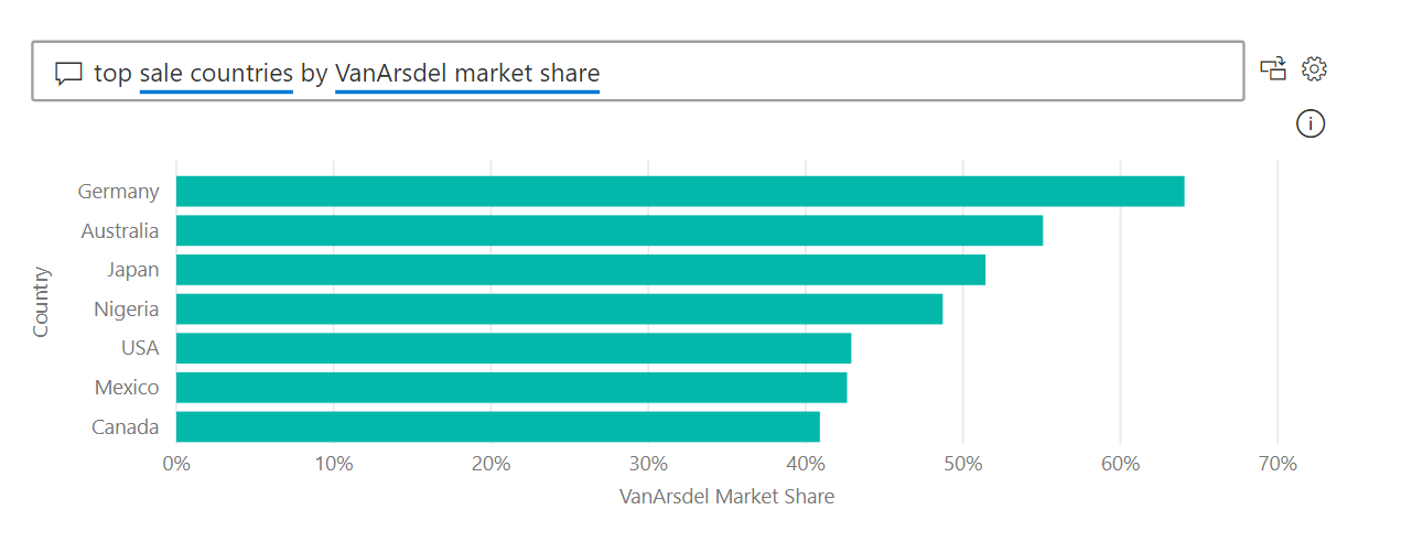
A Q&A visual I created using ‘Power BI Dashboard in a Day’ 2021 data:

The result created after clicking ‘top sale countries by VanArsdel market share’:

2. The Key Influencers Visual
Microsoft Power BI’s key influencers visual is another AI visual built right into the platform. The visual helps users identify which factors influence certain metrics.
“The key influencers visual helps you understand the factors that drive a metric you’re interested in. It analyzes your data, ranks the factors that matter, and displays them as key influencers.”– Microsoft documentation
For instance, assume you’re a sales director at a company, and you want to know what factors influence “deals won.”
You may discover, using your key influencers visual, that factors like “contract length”, “estimated costs”, and “client industry” are all factors that affect the metric “deals won.”
You can also take the insights a step further and use the key influencers visual to determine the relative importance of such factors (do long-term contracts affect “deals won” more than short-term contracts?).
A key influencers visual I created using ‘Power BI Dashboard in a Day’ 2021 data:

3. The Decomposition Tree Visual
The final Power BI AI visualization we’re going to discuss is the decomposition tree visual.
This visualization enables users to drill down into their data to conduct root cause analysis and gain more insights. We can go deeper into our dimensions to determine what causes what!
“ [The decomposition tree visual] is also an artificial intelligence (AI) visualization, so you can ask it to find the next dimension to drill down into based on certain criteria. This makes it a valuable tool for ad hoc exploration and conducting root cause analysis.”– Microsoft documentation
A decomposition tree visual I created using ‘Power BI Dashboard in a Day’ 2021 data:

Here’s a great video from former Microsoft employee and founder of LearnPowerBI.com, Avi Singh, that explains the decomposition tree visual in greater detail.
https://www.youtube.com/watch?v=5_wN-kUIcGs
Questions?
Thanks for reading! We hope you found this blog post useful. Feel free to let us know if you have any questions about this article by simply leaving a comment below. We will reply as quickly as we can.
Keep Your Business Intelligence Knowledge Sharp by Subscribing to our Email List
Get fresh Key2 content around Business Intelligence, Data Warehousing, Analytics, and more delivered right to your inbox!


