By: Matt Wollner
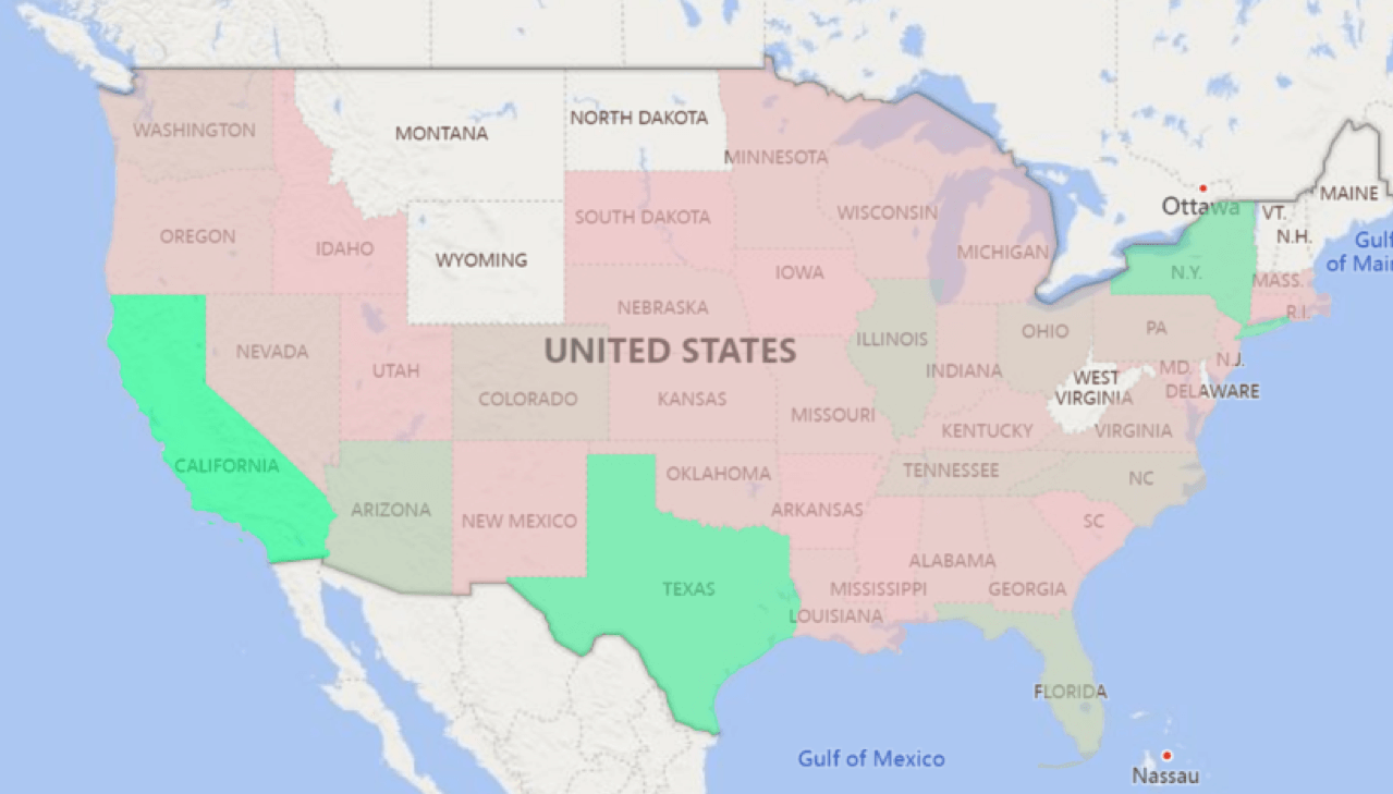
Microsoft Power BI has many great features, two of which are “Bubble Map” and “Filled Map”. Both of these features are map visuals that are easy to set up and have high utility for all users. They are powered by Bing Maps and location data is uploaded to the Bing Map Service.
Another great map visual in Power BI is “Shape Map”, which has been in preview for several years.
In this blog post, I’ll show you how to set up each type of map and discuss some of the limitations of each.
Getting Started
You will need to set the location for your data when working with maps in Power BI. For most business cases, you will not have the latitude nor longitude data, but rather data like “city”, “state”, or “country”. PBI does a fairly good job at mapping these locations, but issues can arise when the name is vague.
For example, I had a list of cities and states as separate columns. Even though I added both city and state, the map placed Alexandria, VA in Egypt! I recommend using latitude and longitude whenever possible in order to have more accurate locations.
Power BI Map Visual: Bubble Map

The Bubble Map will place a circle on top of each location. The bubbles will be different sizes based on the Size field, but there is not a huge difference between the biggest and smallest bubble. The main benefit is by hovering over each data point and looking at the tooltip.
Unfortunately there is not much you can customize with the Bubble Map. Under the Format Tab, you can change the bubble color and the starting size for each circle. By default, the map will show the world, and every time you click on PBI page the zoom will reset. If you would like to focus on a specific region, turn off Auto Zoom under Format / Map Controls.

Power BI Map Visual: Filled Map (Choropleth)
https://docs.microsoft.com/en-us/power-bi/visuals/power-bi-visualization-filled-maps-choropleths

A Filled Map will fill in each location with a color. In the Nov 2019 Power BI release, the Color Saturation field was removed from Fields list. You now need to go under Format / Data Color / Conditional Formatting to change colors.


The Conditional Formatting will let you color based on 2 or 3 colors using the Color Scale, Custom Rules, or with Values (using a color column in your data).
If you define the location as a city, Bing Maps will fill in the city area.

Power BI Map Visual: Shape Map
https://docs.microsoft.com/en-us/power-bi/visuals/desktop-shape-map

A Shape Map will allow you to use a custom map visualization. This feature is still in preview and you will need to turn it on, under options.

The shape map uses TopoJSON files to generate a map. This opens the door to developers to create the map they want to use. The web site mapshaper.org can be used to convert a shapefile, GeoJSON, or a csv to TopoJSON. David Eldersveld’s github has provided several addition maps that may be useful.
To select the map go under the formatting tab / Shape, select a preloaded map or use a download map by clicking + Add Map.

After you select a map you will need to have your data match the key fields in the TopoJSON file. Click View Map Keys to see how the data is formatted.

The map fill can be a 2 or 3 color, Color Scale. The Diverging option will switch from 2 to 3 colors.

Zooming is turned off by default. Turn it on under Formatting / Zoom.

Here is an example of population by county, using this US Counties Map and pulling county census data from here.

Additional Mapping Options
One of the best features of Power BI is the ability add custom visualizations. If you search the Power BI Market Place for “Map”, there are many options for download.
Do you need help with Microsoft Power BI?
If you have a need, please feel free to contact us at anytime. We can help you design and develop a new Power BI solution or customize/adapt an existing one.
Questions?
Thanks for reading. We hope you found this blog post to be useful. Do let us know if you have any questions or topic ideas related to BI, analytics, the cloud, machine learning, SQL Server, (Star Wars), or anything else of the like that you’d like us to write about. Simply leave us a comment below, and we’ll see what we can do!
Keep Your Business Intelligence Knowledge Sharp by Subscribing to our Email List
Get fresh Key2 content around Business Intelligence, Data Warehousing, Analytics, and more delivered right to your inbox!


