By: Mark Seaman
Power BI has three powerful features that make understanding and analyzing your data and visualizations more impactful:
- filters
- slicers
- highlighting
In this blog post, we explore the functionality of these three features.
Power BI Filters
Power BI’s filtering functionality plays a crucial role in refining and tailoring the data displayed in reports to ensure users can focus on the most important information.
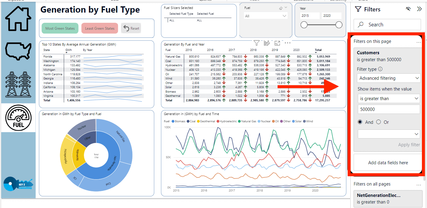
A filter located in a Key2 Consulting demo Power BI report
In Power BI, there are three levels of filters:
- Report-level filters
- Page-level filters
- Visual-level filters
Report-Level Filters
Report-level filters are used to constrain the dataset at the highest level, excluding information from the entire report. Doing so ensure that the report showcases only the specific subset of data that is relevant to the intended audience.
Example: Consider a dataset covering sales data for the entire United States. If the report’s objective is to highlight sales performance specifically in the southeastern region, a report-level filter can be employed to exclude data from other regions.
Page-Level Filters
Page-level filters function similarly to report-level filters but are made for specific pages within the report. This allows developers to create pages with different focuses, each displaying a subset of the overall data.
Example: A report has multiple pages, and one of those pages is made to show sales for the rolling 12 months. A page-level filter can be applied to this page, focusing exclusively on the selected timeframe.
Visual-Level Filters
Visual-level filters allow for fine-tuning of visuals within a report. These filters are applied at the visual level, allowing developers to highlight specific details or trends in individual charts or visuals.
Example: A visual representing the top 10 selling products needs to be created. A visual-level filter can be used to show only the information related to these top-performing items, providing a focused view of the needed points of the data.
Pro Tip: Once the report is uploaded to the workspace, end-users cannot modify these filter settings.
Conclusion – Filters
Power BI’s filtering capability has many different purposes. It can help developers create reports for targeted insights, and each filter type has its own utility for making reports more consumable.
Power BI Slicers
Slicers in Power BI enable interactivity for users to modify and customize the content displayed on a report page. These dynamic tools offer a user-friendly way to control data presentation without making structural changes to the underlying report.
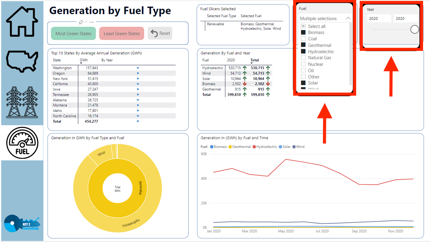
Two slicers located in a Key2 Consulting demo Power BI report
Dynamic Modifications
Slicers give users the ability to make real-time adjustments to the content of a report. This dynamic feature is valuable in scenarios where the data being analyzed is subject to frequent changes or updates. Users can instantly modify slicer settings to reflect the most recent data or to focus on specific aspects of the information.
User-Friendly Interface
Slicers come with a user-friendly interface, often in the form of buttons and visuals. This enhances the overall user experience and makes it easy for users to navigate and customize a report to the needs of users, no matter their expertise.
Multiple Slicer
One of the most powerful capabilities of slicers is the ability to implement multiple slicers on a single report page. Doing so allows users to change the data views based on different needs. A report may have slicers for date ranges, product categories, and geographic regions, allowing users to filter and analyze the data.
Furthermore, by leveraging multiple slicers, users have the flexibility to explore data from different angles. This feature is particularly beneficial when dealing with complex datasets that contain diverse dimensions. Users can experiment with various combinations of slicer settings to uncover insights and trends that may not be immediately apparent in a static report.
Improved Interactivity
Slicers allow an interactive reporting environment, engaging and exploration. Users can experiment with slicer settings to instantly see the change on the displayed data. This allows a more collaborative way of data analysis, allowing users to iterate through different scenarios and make better conclusions.
Conclusion – Slicers
Slicers provide users with a dynamic and interactive way to navigate and analyze data. Their ability to make real-time adjustments and support multiple ways enhances the overall flexibility of reports, making them valuable assets in data-driven decision-making processes.
Power BI Highlighting
Power BI’s highlighting functionality goes beyond traditional data filtering methods by offering a dynamic and interactive approach to data consumption. With highlighting, users can garner more information and focus on the most important parts of their data.
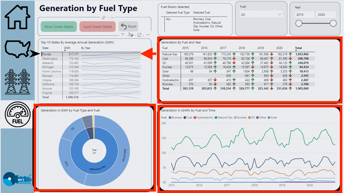
Highlighting feature displayed in a Key2 Consulting demo Power BI report
Key benefits of highlighting in Power BI reports:
1. Interactive Data Exploration
Highlighting allows users to interact and explore their data by selecting specific data points within a visual. It provides a way to analyze the impact of individual data points (and/or groups of data points) on other visuals in a report.
2. Emphasizing
Highlighting in Power BI can create a visual emphasis on selected data points that helps users quickly identify and understand important information. Users can easily spot outliers, trends, specific categories, and more, empowering them to make more informed decisions.
3. Consistent Cross-Visual Interaction
Highlighting in Power BI ensures consistent interaction across visualizations on the report page. When a data point is selected in one visual, it is reflected in all related visuals, creating an easy experience for the user.
4. Focus in Graphs
When you select data in a chart or graph in a Power BI report, the selected data is visually highlighted. This makes it easy for users to see any differences between the selected and non-selected data. It also helps the user to see specific data points in detail without having to use the entire dataset.
5. Streamlined Presentation in Tables
Highlighting in Power BI tables simplifies the presentation of the table by displaying only the selected data and removing visual clutter. Focus is brought to the information that’s been selected, which aids users in more easily communicating information about the data points.
Conclusion – Highlighting
Power BI’s highlighting capability allows for better data exploration and presentation by offering an interactive approach. It goes beyond conventional filtering methods, giving users a powerful tool to get more out of their data.
Keep Your Data Analytics Knowledge Sharp
Get the latest Key2 content and more delivered right to your inbox!