")
This blog post explores what a “dashboard” is in Power BI, what a “report” is in Power BI, and what the differences are between the two. Throughout our experience providing Power BI consulting services to companies, we’ve noticed a fair amount of confusion around the two Power BI terms!
This blog post’s intent is to help clarify the nomenclature.
What is a Power BI Dashboard?
A Power BI dashboard is a single page of visualizations that tells a story about your data. This “storytelling” helps report consumers learn about their data, glean important insights, and identify important trends – all to help improve business intelligence and decision-making.
Here’s an example Power BI dashboard we made:
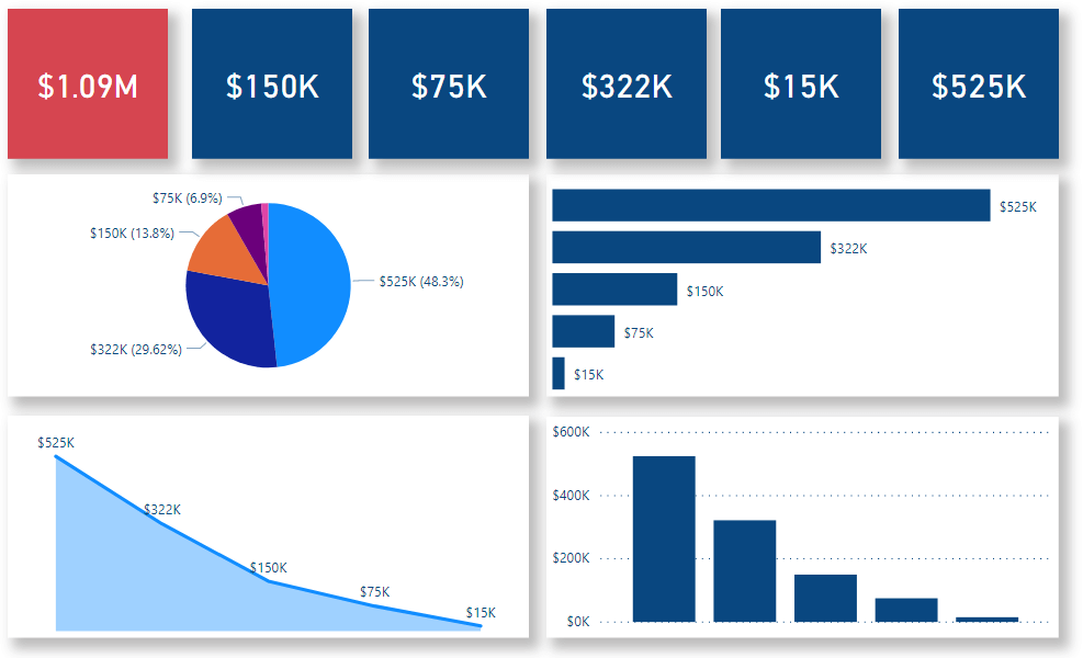
The dashboard above consists of five different types of visualizations. The top row of red and blue squares are “card” visualizations, while underneath those are pie chart, bar chart, and area line chart visualizations.
Power BI dashboards are designed to display the most important information as efficiently as possible. Or, as Microsoft’s official documentation so eloquently puts it:
“Because it is limited to one page, a well-designed dashboard contains only the most-important elements of that story.” – Microsoft
This is why Power BI dashboards are almost always designed for – and requested by – decision-makers at an organization. More on this later!
What is a Power BI Report?
Here’s a great definition from Microsoft on what a Power BI report is:
“A Power BI report is a multi-perspective view into a data model, with visualizations that represent different findings and insights from that data model. A report can have a single visualization or pages full of visualizations. Depending on your role, you may read and explore reports, or you may create them for others.” – Microsoft official documentation
Now let’s break that down a bit.
When you’re working with Power BI, one of the key steps you must complete before creating interactive visualizations is to model your data.
Doing so enables the creation of interactive visualizations, as relationships between datasets must be established in order for useful visualizations to be made. This is what Microsoft is referring to in the first sentence of the definition above.
When creating a Power BI report, you’re creating visualizations that tell a story about the underlying data model you’re working with. Note that a Power BI report “can have a single visualization or pages full of visualizations.”
Power BI Report Example
Below is an example of a Power BI report we’ve created. It’s actually part of our Power BI demo that we provide to clients and prospects who are interested in learning more about Power BI and what the platform’s capabilities are.
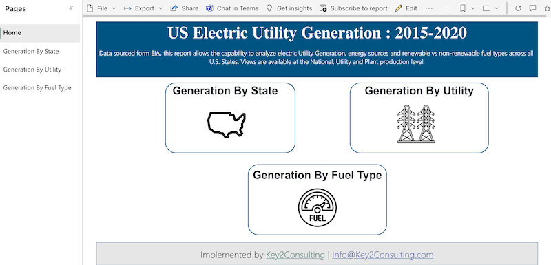
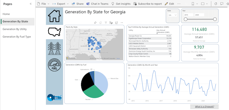
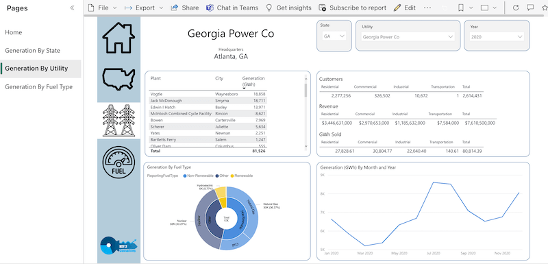
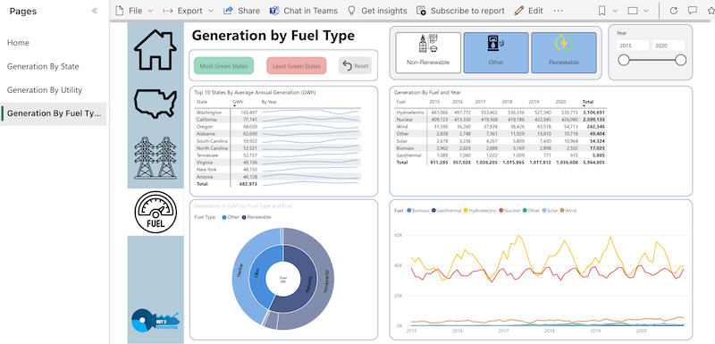
Notice the Power BI report has multiple pages, which can be navigated by using the menu on the left-hand side of the canvas. This is a key difference between a Power BI dashboard and a Power BI report, which we’re going to get into now.
The Differences Between a Power BI Dashboard vs Report
Now that we’ve defined what a Power BI dashboard is and what a Power BI report is, let’s take a look at the major differences between them.
1. One Page vs Multiple Pages
Recall that a Power BI dashboard is a single page of visualizations. This is a very important distinction from a Power BI report, which can be a single page or multiple pages of visualizations.
A Power BI report can be hundreds of pages long if you wanted it to be.
2. Intended Use/Purpose
Another key difference between a Power BI dashboard and a Power BI report is their intended use.
Because a Power BI dashboard is a single page of visualizations, it is meant to be used as a highly informative piece of information that is quick and easy to digest.
A Power BI dashboard often contains the most critical elements of a Power BI report, or in other words, the most important information that consumers should know.
We like how Microsoft puts it:
“One way to think of a dashboard is as an entryway into the underlying reports and datasets. Selecting a visualization takes you to the report that was used to create it.” – Microsoft official documentation
This is why managers, directors, and C-level executives at companies are often looking for dashboards. They provide the most important information in the most efficient manner possible. A report, on the other hand, is often used to provide a lot of detailed information.
3. Means of Creation
Another key difference between a Power BI dashboard and a Power BI report is how they are created.
A Power BI report is created in Power BI Desktop, Microsoft’s free version of Power BI. With Power BI Desktop, users can gather data from various sources, create a model for that data, and then build interactive visualizations on a blank canvas to ultimately create reports.
When the report is ready for consumption and distribution, users publish it to the Power BI service, which is essentially the cloud version of Power BI.
It is in the Power BI service where dashboards can be created. The service enables users to grab different pieces of a report (called “tiles”) and place them on a single page, blank canvas.
Once the canvas is filled to one’s liking, a user can publish the page, which then becomes a dashboard. Both Power BI reports and Power BI dashboards can be easily viewed, shared, and distributed from the Power BI service.
4. Data Alerts (Email Notifications)
One final key difference between a Power BI dashboard and a Power BI report is that users can set “data alerts” on Power BI dashboards. Using the Power BI service, users can set up email alerts on certain types of visuals.
To learn more about this useful feature, check out Microsoft’s documentation titled, Data alerts in the Power BI service.
Thanks for Reading! Questions?
Thanks for reading! We hope you found this blog post useful. Feel free to let us know if you have any questions about this article by simply leaving a comment below. We will reply as quickly as we can.
Keep Your Data Analytics Knowledge Sharp
Get fresh Key2 content and more delivered right to your inbox!